
Websites · Real Estate
Real Estate Website
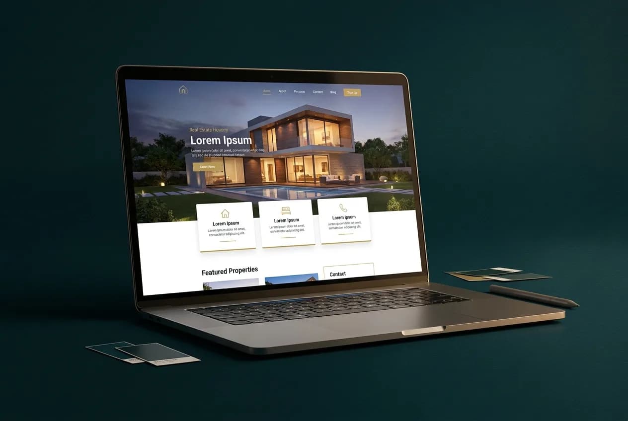
A design exploration for a boutique real-estate brand — refined listing presentation, area storytelling, and a visual identity built around dusk-lit photography.
Project preview
The Challenge
What This Project Explores.
Real-estate websites tend to look interchangeable: same portals, same grids, same blue. For a boutique agency whose value is taste and local knowledge, that sameness is a positioning problem. This exploration asks how far considered design — typography, photography, pacing — can differentiate a property brand online.
Objectives
- Develop a visual identity that signals boutique quality rather than portal volume
- Present listings with editorial pacing instead of dense grids
- Give neighbourhood knowledge a home through area guide structures
- Design enquiry moments that feel personal, matching a relationship-driven sales process
Strategy
The Thinking Behind the Build.
- 1
Build the identity around dusk photography — warm windows, deep skies — to own a distinctive mood
- 2
Let each listing breathe: one property per viewport with generous imagery before any specification table
- 3
Pair every listing with its neighbourhood story to showcase local expertise
- 4
Replace generic contact forms with agent-fronted enquiry panels that set up a conversation
Services demonstrated
From Plan to Delivery
Process, Technology, and Deliverables.
Process notes
- Audited common real-estate site patterns to identify what to deliberately avoid
- Developed the photographic direction first and derived colour and type from it
- Explored listing layouts across three fidelity levels before committing
- Designed area guide templates as a long-term content and SEO framework
Technology
- Design system with reusable listing components
- Typography and colour identity system
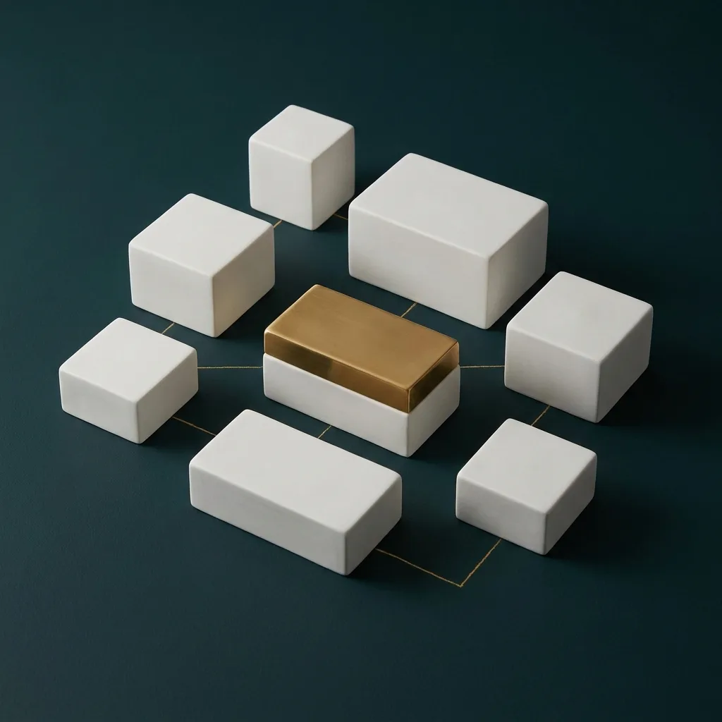
- Area-guide content architecture
- CRM-ready enquiry integration points
Deliverables
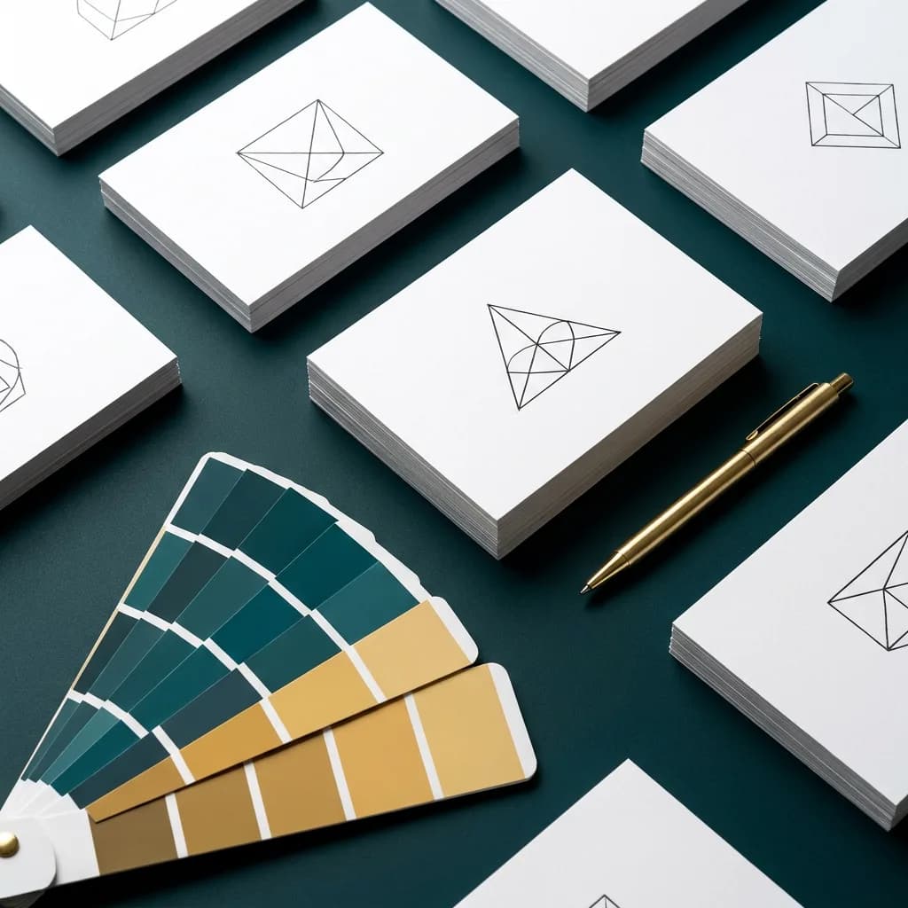
- Brand identity direction — type, colour, photography
- Homepage and listing page design concepts
- Area guide template designs
- Agent-fronted enquiry panel designs
Gallery
A Closer Look.
The Result
Final Experience and Outcome.
What the final experience delivers
Browsing feels closer to reading a well-made property magazine than scanning a portal: each home is given room to make its case, the neighbourhood context is part of the story, and reaching out feels like starting a conversation with a person, not submitting a ticket.
Outcome
The exploration demonstrates how brand identity and web design decisions reinforce a boutique positioning. It informs how we approach premium service brands in any sector where differentiation rests on presentation and trust.
Related Services
Build Something Similar.
Imagine This Approach Applied to Your Business.
Every project here started with the same question we'd ask you: what does your business actually need to work better? Let's answer it together.
Prefer to talk? 226 238 8284 · miilind@nyzdigitals.com